AMA Auto Insurance Quote Tool
A redesign of the look and feel, and user experience of the Alberta Motor Association's insurance quote tool.
From the concept to prototyping for user testing, this was a fun, yet challenging project to work on. The goal was to create an auto quote tool that was easy to understand, and not overwhelming for the user to complete.
View Live SiteIn the beginning there were flows
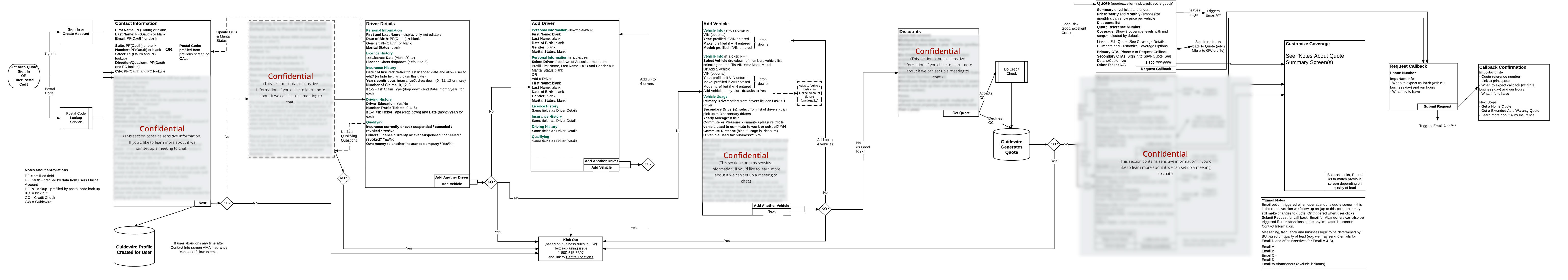
Flows proved to be crucial in this project. It allowed us early on to see just how detailed it can be to capture an auto quote. There is tons of information and many working parts when it comes to creating an accurate quote, while keeping inline with business requirements.
To ensure we had a solid strategy before diving into the design, there was lots of back and forth with the UX team to make sure the flows were complete and accurate. Once the team felt we had a solid understanding of the back-end system and the needs of the business unit, I worked closely with our usability expert while designing the wireframed screens and high fidelity mockups based on the technical flows that the UX team put together.
Having a document like this to work from was helpful to keep in mind the information we captured, and how it may be useful to us without having to think right away about how the user would interact and provide the information we needed. A document as technical as this one allowed me to see the information without imposing any ideas of the actual screen and experience flow of the user.
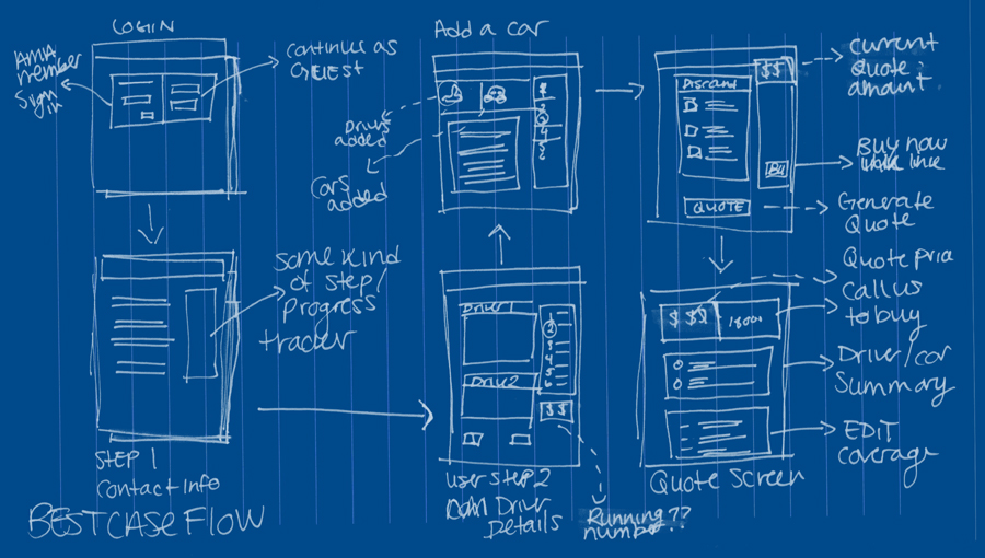
A working draft of the thumbnail screen flow
Once I had a technical flow of the quote process from front-end user info, to how that information is being stored and handled in the back end program, I was able to create a thumbnail flow of what information could work on which screen. I worked through many different variations of thumbnail scribble to try and see the information from the point of view of the user, in manageable chunks.
Taking the detailed technical flows and starting to filter that information down into screen groupings while starting to think of page layout elements, allows me to organize all the ideas I have in my head and cut back on brain fog. Creating thumbnail flows helps me visualize the UX flow in a very high level way, but still relating to the design ideas I have.
UI Elements
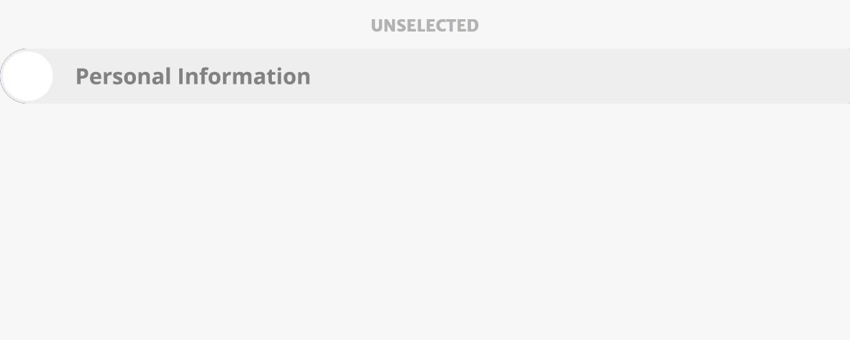
A particular challenge that arose during the design stage was displaying information to the user in small digestible pieces. We didn't want users to become overwhelmed by the large empty form, or too many steps and abandon the form all together.
To combat this problem I created a new element for AMA's UI pattern library. I designed sub-step accordions to break apart steps that were too large on their own, but couldn't be broken out into stand alone steps.
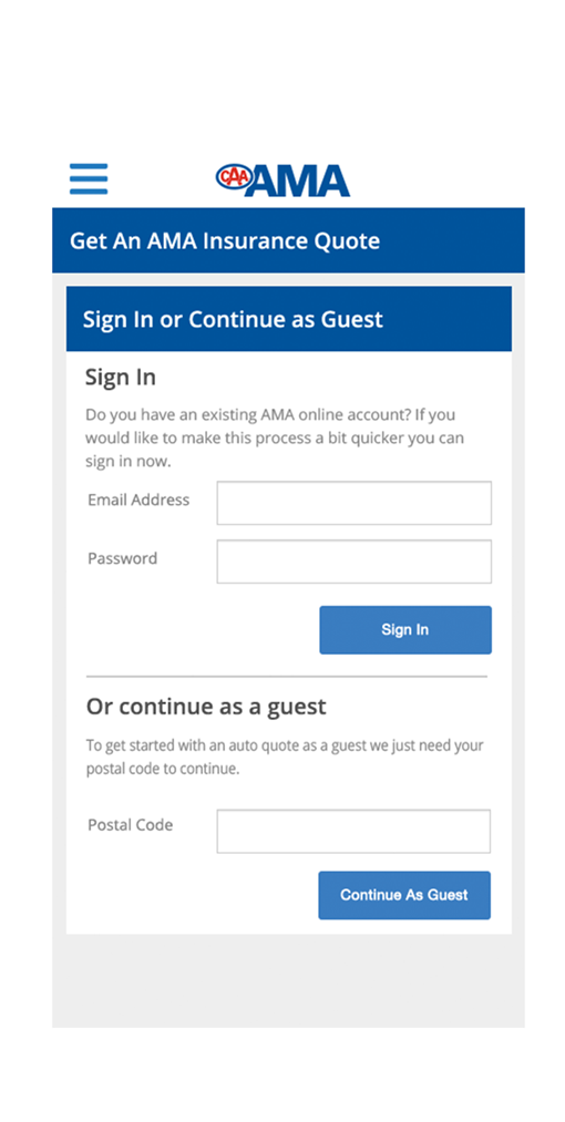
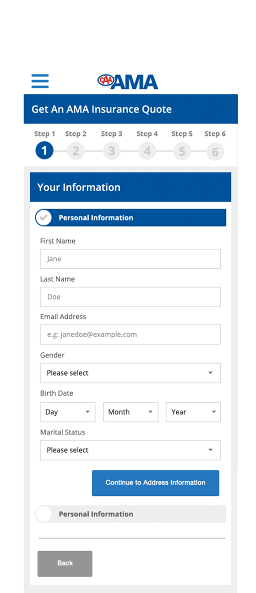
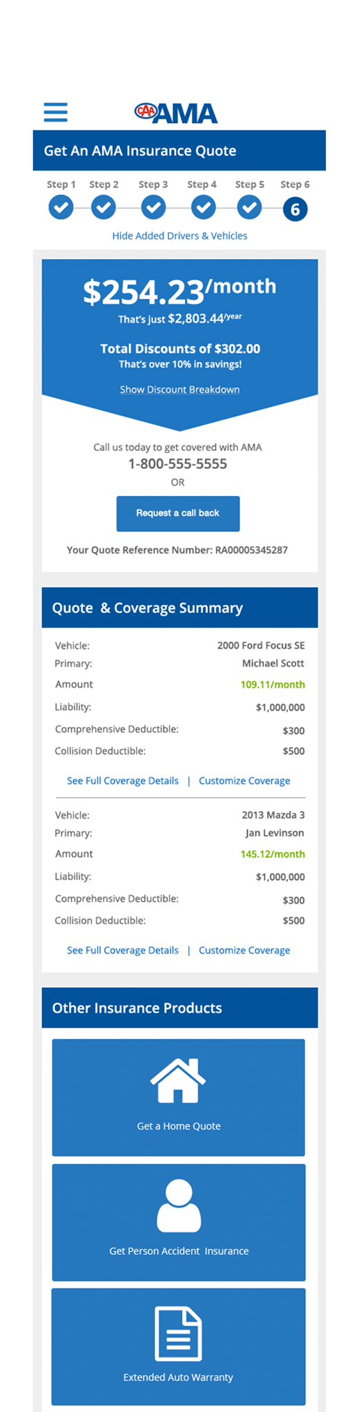
High Fidelity Mockup Screens / Page states
Mobile Screens